Testing Creative Ideas We See in the Mail

Michelle Johnston
Senior Manager of Strategic DevelopmentAs a part of my job here at PS, I am exposed to a LOT of mail. And one of my favorite job responsibilities is to share a monthly testing PowerPoint deck we call “Michelle’s Mailbox”. These decks are sent to the staff and can be sent to clients to share creative options from what we see in the mail.
Here are 3 recent ideas we shared that I hope will help spark a creative conversation about how you may be able to use these ideas in your mailings. (Note: We have chosen not to share the original artwork and instead mocked up similar art that illustrates the ideas we are showcasing. Production Solutions does not take credit for these ideas but is sharing them to celebrate the wonderful ideas we are seeing.)
Idea 1: Go Horizontal
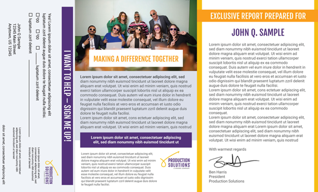
Newsletters and other cultivation pieces are important to donors, but they may not be big money-makers for every organization. Try thinking about your content and format to share it differently. This example uses a standard 8.5 x 14 letter/reply form but turns it on its side to deliver an “exclusive report” which is prepared just for your donors. This option can allow you to use digital printing (VDP) to produce a fully variable option that can be shared with many audiences. This can also be produced with traditional print methods – however; you need to remove the color personalization (for instance the name of the donor under the “Exclusive Report Prepared For”). A package like this offers multiple possibilities including testing within an existing #10 letter package, or printing this side by side with an additional letter/petition/coupons/etc.
Idea 2: Use 2 Reply Forms to Entice Donors to Move to Monthly
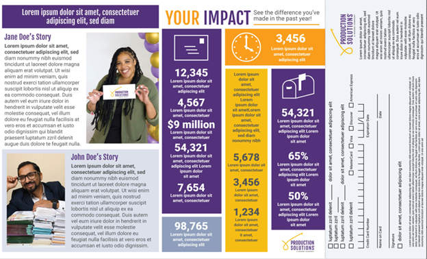
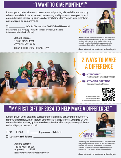
Many organizations are trying to grow their monthly giving program. Multiple organizations find it difficult to acquire new monthly donors in the mail. But it doesn’t mean you shouldn’t be mailing to those donors you may want to convert. This mailing was sent to me as a donor – after a recent gift – and offered me the chance to become a monthly donor. The ask included a reply slip for a monthly donation, a second reply slip where I could make a second 1-time donation, and a QR code I could use to give online to either request. Here are a few related details to point out:
- The monthly donation amount was left blank for me to fill in.
- The first monthly gift would be doubled.
- The first ask amount of the 1-time gift matched my previous gift amount.
- Finally – the middle panel laid out my two options as this:
- Give Monthly – and your first monthly gift will be doubled.
- Give a single gift now – and provide immediate help.
Idea 3: Use an existing Member Card Double Window OE for another purpose.
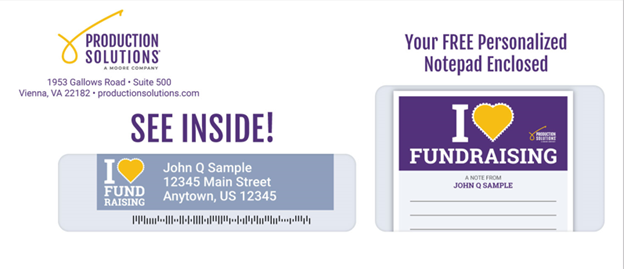
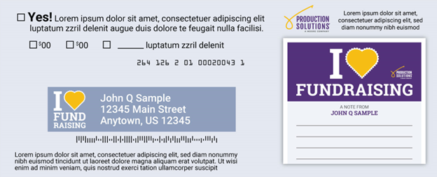
Many organizations send a member/supporter card to their donors. Those double-window envelopes can be a great way to showcase more than just member cards. Here the larger window shows a preview of the personalized notepad inside (and the address block shows a preview of the address labels). And that is not all you can do with this kind of envelope – add a personalized message in the larger window, affix a premium (like a magnet or a decal) to show in the window, or even add an image that might normally print onto the envelope. That reduces this envelope to a double window envelope with a pre-printed logo (and possibly an indicia), that can be used in multiple mailings.
Do you have any questions, or want help testing one of these options in your next mailing? Reach out to your PS contact.
About the Author

