The USPS Promos for 2023 have started with a bang as we have seen more and more approvals for campaigns utilizing the current Tactile, Sensory and Interactive promotion. And now we want to take a look forward to the next big promotion for non-profits: Emerging and Advanced Technology. This year, the promotion is absorbing the former Mobile Shopping Promotion from 2022 and now includes the use of QR codes. Let’s start with a few basics on the promotion:
- Registration starts: March 15, 2023
- Promotion runs: from May 1 – November 30, 2023
- There are 2 discounts offered:
- Up to 3% discount on packages that include QR Codes, Basic Voice Assistant Integration, and Enhanced Augmented Reality
- Up to 4% discount on packages that include Advanced Voice Assistant Integration, Video in Print, Near Field Communication, Mixed Reality and Virtual Reality
For most non-profits, we believe that the most accessible of these technologies will be adding a QR code to the mailing. There has been an increase in the use of QR codes since the pandemic and many donors – even those who may not be particularly tech-savvy – are used to using them now.
There are a few details you should be aware of when designing your mail piece using a QR code:
- The QR code can’t be on the reply device or reply envelope.
- You must include directional copy telling the donor how to use the QR code.
- However, the directional copy can not direct people away from the mail specifically.
- For instance, you can say “Donate Now” but you can’t say “Click here to go paperless”.
- The QR code must be at least ½ inch by ½ inch.
- The landing page can include pop-ups as long as the donor can exit from them.
- The landing page must be a donation site, however, it may also contain additional information like video content or storytelling.
- The landing page must be mobile-optimized.
For more information on how to take advantage of this promotion, we asked Marketing Manager and PS website guru Danielle Burns to offer up some suggestions for how to optimize your QR code campaign for success. Danielle had the following suggestions for things to consider when setting up your campaign:
Dynamic vs. static QR codes
With proper setup and integration with Google Analytics, dynamic QR code traffic can be tracked, making it easy to tell at a glance how well your QR code campaign worked. You can also update the URL for a dynamic QR code, meaning you can reuse the same code many times. This comes at a price, as dynamic QR codes usually cost money to generate, and may require a subscription to continually update, depending on the QR code generator you use.
Static QR codes can be generated for free, but are limited to pointing users to one URL, and the traffic cannot be tracked automatically. To track static QR code traffic, consider creating a landing page with a unique URL that is used only for your QR code campaign.
Landing pages and mobile optimization
To qualify for the USPS mobile shopping promotion, your QR code must link directly to a page with a donation form. That said, it doesn’t have to be your website’s default donation form page. Consider creating a donation page specific to your campaign – use similar art and text so potential donors know they’ve reached the right page. You may also include additional information and resources for your visitors (newsletter signup, links to success stories, etc.), but be sure the donation form stays prominent.
The next major consideration is mobile optimization, which is required to qualify for the USPS promo discount. Web design best practices call for all websites to be mobile optimized, since over half of web traffic globally is generated by mobile devices. (source) Mobile optimization for content accessed via QR codes is even more crucial since mobile devices are almost exclusively used to scan them. Ensure that your donation form fits correctly on a mobile screen and can be easily navigated and filled out on a phone or tablet.
QR code design
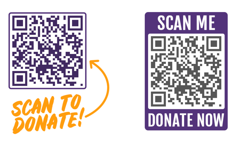
The most basic rules for the design of the code itself are to be high-quality (not blurry or pixelated) and high contrast. While QR codes are not limited to the standard black-and-white color scheme we’re all accustomed to scanning, it is still best to use a light background and a dark color for the code itself.
Make sure readers know exactly what will happen when they scan your code. Wording as simple as “Scan here to donate” leaves no room for confusion and serves as a call to action for potential donors. As noted above, such directional copy is also required to qualify for the promotional discount. Here are a couple of examples:
Test and test again
The last thing you want after you’ve put so much effort into your QR code campaign is for the code to be unscannable. Test multiple times on printed proofs, with different devices if possible.
Production Solutions would love to help you get your campaign up and running. For more information, please reach out to your account team.

