Does Direct Mail Have You Seeing…Pink?

Meredith Piemme
Business Development DirectorWe’ve all been there. You’ve spent days, nights, weekends perfecting your direct mail package. Tweaked your copy, agonized over your asks, selected the perfect pictures. Then the day arrives, your samples are here! You tear open your package, so excited to see your efforts on paper and it’s beauti…. wait, why is that pink?! It’s supposed to be red! What happened?!
The quick answer? It’s likely a CMYK build of a PMS (spot) color or possibly a bad mix of the actual PMS color. A more thorough answer lies in understanding inks, papers and color management.
As a self-professed direct mail geek and lover of all things print, I could spend hours talking about the wonders (and horrors) of color and ink. For today, we’ll keep it out of the weeds and offer more of an overview starting with PMS vs. CMYK vs. RGB.
PMS is an acronym for Pantone Matching System, the designers’ and printers’ bible for all things color. PMS, Pantone and spot color are all terms for the same print process. Pantone inks come in all different colors of the rainbow, including neons, metallics and pastels. Printers can buy cans of specific PMS colors, or they can mix their own based on the formulas found in the Pantone guides. You can see where I’m going with this… it’s entirely possible, even with a specific spot color spec’d on your art, that it could end up looking different between two printers, even on the same stock.
If your brand (PMS) color is CRITICAL, you can request an ink drawdown or a press proof from your printer to verify that the color is spot on every time (pun intended). However, these can be quite expensive, so if tolerating a small shift in tone is acceptable, you can save money by eliminating this step, or saving it for high-end projects like annual reports, or other organizational collaterals (think pocket folders and brochures).
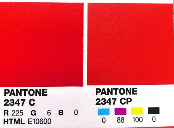
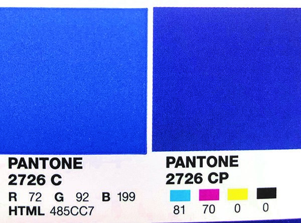
Moving onto CMYK… this is an acronym for Cyan/Magenta/Yellow/Black. These four inks layered on top of one another, create almost every conceivable color of the rainbow. *Fun Fact: inks are TRANSPARENT! CMYK is used to create full color pictures and logos. The process of CMYK printing will never be able to replicate the brightness/saturation of some PMS colors. Indeed, the CMYK build (various percents of each color) of a PMS color may not look anything like that PMS. Hence, the red that suddenly looks pink, or the purple that is now blue.
To help designers and printers avoid this issue, Pantone has a swatch book called a Color Bridge Guide. This guide shows the PMS and it’s respective CMYK build side by side. Utilizing this tool can help you avoid color shift and nightmarish outcomes on your print pieces. Below are a couple of examples from the guide to illustrate just how much a spot color can shift when converted to a CMYK build.
If you can’t tolerate your PMS color to be converted to a CMYK build, understand that it will always have to be run as a +1 color on all printed pieces. So instead of a full color brochure, you will have a full color +1. This can add significant cost, and in some instances, time, to your projects (and should be avoided where possible).
Have your eyes glazed over yet? If so, STOP READING and know that Production Solutions understands everything there is to know about ink and color and can manage all of this FOR you. If you are loving this as much as I do, let’s keep going!
So what in the world does RGB have to do with anything? Ideally, in print, it shouldn’t even be in the conversation. RGB is shorthand for Red/Green/Blue, these are the three colors that are layered in digital media to create all the colors of the rainbow. RGB is used in raw photography files, monitors, and other screens like cell phones and tablets. We can’t actually print anything in RGB, so files that come to us in an RGB color profile are automatically converted to CMYK. What’s wrong with that, you might ask? Take a peek at the image below, left is the original RGB file, to the right is the image converted to CMYK without any additional editing. Awful, right? Many images need curves and/or levels adjusted to compensate for the new profile. Understanding press profiles and image editing is a topic that could take up a whole blog post by itself. Suffice it to say a good designer can help you with this, and most prepress departments have the capability to adjust images as requested.

Requesting contract proofs for any full color printing can help you avoid a nasty surprise on the final product. You’ll have the opportunity to identify undesirable color shift in a spot color build or a photo that is too dark or that the highlights have blown out.
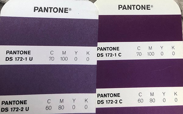
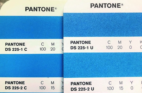
The last piece we’ll address here is how inks change across stocks. Did you know that there are Pantone guides for coated AND uncoated stocks? That’s right! Your special PMS blue looks completely different on a 60# white offset and a 100# coated text. Many organizations have a PMS color and/or CMYK build spec’d specifically for coated and uncoated stocks. Again, take a peek below for a coated vs. Uncoated PMS ink, the difference is significant.
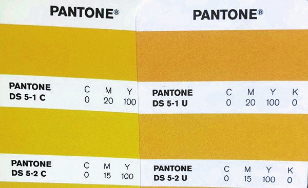
The stock finish also needs to be considered in regard to images. On an uncoated stock, the ink is absorbed by the paper, creating something called dot gain. This can make dark portions of an image even darker, resulting in a muddy image. On a coated stock, the ink sits on top of the paper, so dot gain is not as much of an issue. The coating also allows for a crisper, sharper image. That’s why so many catalogs and magazines are printed on a coated stock. If you don’t like a high-gloss finish, but still want a crisp image, you can request a dull, matte or satin coated stock, or add a satin aqueous coat overtop of a standard gloss sheet and achieve much of the same effect.
Last point on stocks: as inks are transparent, printing a full color image or a spot color on a colored stock (canary, ivory, blue, etc.) will shift the ink colors into that color family. For example, on a blue stock, a photo will take on a blue hue. This effect can be compensated for in prepress as needed. And, if it is crucial to get your color to really “pop” you can underprint with an opaque white ink and then add the color on top to more fully mitigate the paper color underneath.
Whew! That was a lot and I thank you for hanging in there until the end! We hope that this has shed some light on inks and color management. If you’d like to learn more about this fascinating (IMHO) topic, or if your head is spinning and you want to pass off all of your color headaches to consummate professionals (like Production Solutions) you can reach us at 703.734.5700. We’ll make sure everything looks right, every time!
About the Author

Meredith Piemme
Business Development DirectorMeredith, a passionate team player, is a Business Development Director serving PS since 2018. Meredith has over 20 years of experience in graphic design and print, and over 10 years of experience in the direct mail and nonprofit industry. Meredith has a determination to ensure that each of her clients have an impeccable service experience. Her kindness and humor, and her ambition for investing in success are just some of the reasons why Meredith promotes such value in the PS family.
Hailing from Centreville, Virginia, she loves spending time with her family, traveling, and is an Orange Theory Fitness devotee. Her favorite holiday is Thanksgiving and she has a love-hate relationship with her minivan!

