When Opposites Attract; Integration Wins at the 2015 MAXI Awards
 Production Solutions
Integration is the process by which messages, themes, requests and information are coordinated and unified around a common goal. Innovative integration is taking that process and making it exciting! This year, 68 awards plus 2 Big Winners were presented from almost 300 entries. Our Director of Strategy and Trends, Cheryl Keedy, and our PS Digital Vice President, Jim Jacobs, weigh in on some great examples of innovative integration from DMAW’s 2015 MAXI Awards:

Non Profit Special Appeal – Bronze MAXI
Agency: Lautman Maska Neill & Company
The Mail Format: 9 x 12, High-Touch Year End Mini Proposal
From Cheryl’s PerspectiveFrom Jim’s PerspectiveThis 3-way match format included many of the elements of a special communiqué starting with the oversized outer envelope enhanced by the full color tint, faux address label and an attention-demanding address label teaser “Personal and Confidential”. A 9% response rate for the direct mail segment indicates this strategic approach was right on target.
Inside, the simple but powerful communiqué had the look of a “special correspondence” enhanced by the paper-clipped business card and highly personalized letter from PCRM’s President, Neal Bernard. Donor focused phrases throughout the letter included “It’s your determination and your commitment” and the postscript: “With your help we’re very close to making that dream a reality,” communicated the importance of each donation in reaching the overall goal of $100,000 by year end.
Interestingly, the reply form for PCRM’s compelling mission-focused appeal included an additional incentive for gifts of $55 and higher: a “Special Campaign Gift” water bottle. Of greater importance and trending was the option to “opt-out” of receiving the premium and dedicating the entire gift value to the mission of the organization. In this way, the organization enabled the donor to self-identify as “non-premium” responsive; another subtle approach to weaning a premium responsive file to mission-focused. The reply form also included an endearing black and white image of a puppy – just one of many victims that PCRM is focused on helping. The same puppy image was used in the email campaign, but in that channel the image was in color and the pup was identified as “Keda”.[/tab] [tab]While the email portion of this integrated campaign was more basic than the creativity of the mail campaign, the extension of the campaign to coordinated email had a valuable, additive effect. The 1.44% response rate for the emails overall was more than double their nonprofit vertical average. The approach of bookending the mail campaign with two emails probably had a positive effect on the mail response rate for supporters who received both communications. The second, post-mail, email should have attracted people who had not yet acted on the mail appeal to take a quick action online. Some additional ideas that could have delivered even better email results would have been a third email scheduled to arrive on the same day as the mail delivery, and inclusion of the water bottle premium. We don’t know about subject line or design testing that might have been done in the first email, but that’s always a great way to optimize.[/tab] [/tabcontent] [/tabs]
The Performance Metrics: The goal was to raise $100,000 by the end of December 2014 and PCRM nearly tripled that goal!
The Campaign: Food Bank of the Rockies (FBR) July Donor Renewal
Nonprofit Renewal – Bronze MAXI
Agency: RobbinsKersten Direct
The Mail Format: Invitation Style, Matching Gift Challenge
From Cheryl’s PerspectiveFrom Jim’s Perspective
The pitch was a $50,000 Matching Gift Challenge Campaign and the possibility of distributing 400,000 meals if the Challenge (Match) was met – thereby doubling the impact of the $50,000 initial Challenge Gift. The audience select were donors who had established a preference for giving online.
This July campaign used a distinctive baronial sized envelope (5-1/4 x 7-1/4 is just one option under the umbrella of “invitation” sizes) with the outer envelope corner card referencing “OFFICE OF THE PRESIDENT”.
Keeping it simple but special was the strategy of the two-way match with the core components of closed face outer envelope, letter/reply and BRE on matching cream paper. The Charity Navigator endorsement appeared on page one of the personalized letter, and on the reply form the CoBank logo was referenced as the Challenge Match provider. The reply form included an invitation to enroll as an “Elite Sustainer” member, with an open ended ask. Best practice: never miss the opportunity to grow the Sustainer program! The reply also included the option to make “a secure donation” online with the simple URL: foodbankrockies.org.
And if you didn’t think the Challenge was urgently needed you were reminded repeatedly with the “handwritten teaser” gift deadline of 8/31/14 referenced on the reply, BRE and letter, all reinforcing the limited opportunity to double each dollar received once the match goal of $50,000 was met.
A clear call to action and compelling message from the President of the Food Bank of the Rockies helped to drive the direct mail response rate of 8% with an average gift of $100. Outstanding performance for the Food Bank of the Rockies![/tab] [tab]Online giving saw a surge for this particular appeal, partly attributable to the distribution list being segmented by their preference for online giving. Because of this tactic, FBR smartly started the three-email campaign after the mail piece delivery. Although simple in approach, the emails effectively put the matching gift and it’s potential impact at the forefront of messaging and visuals. A similar direct approach to the landing page and donation form should have helped maximize completion rates, as well.
Interesting observation: visual presentation of the MAXI campaign winners did not include web landing page and form images. These components of the online campaign are equally critical to the emails; poor execution of these will result in a high abandonment rate.
A 21% open and 11% click through rate are each well above benchmarked averages, which makes sense with such a targeted segment of FBR’s house file. More notable, the average online gift of $250, while well above the average direct mail gift, is significantly higher than the benchmark for one-time fundraising gifts in their vertical.[/tab] [/tabcontent] [/tabs]
The Performance Metrics: Together, all channels generated 638% net ROI and enhanced FBRs relationship with their online donor base.

Nonprofit Special Appeal – Gold MAXI
Agency: Lautman Maska Neill & Company
The Mail Format: Invitation for a Limited Opportunity
From Cheryl’s PerspectiveFrom Jim’s Perspective
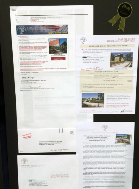
The May MCHF Brick Invitation earned a Gold MAXI so you’d think the format had to be over-the-top but once again a simple combination of three matched components – the outer envelope, letter and reply effectively conveyed an emotional message to the donor audience. Peppered with four color images throughout the letter and reply, donors were invited to “Make a permanent tribute to fellow Marines by purchasing an engraved brick…at a discounted price– a special offer for committed members like you”.
“Engraved Brick Registration Form” is the title of the response device with a red teaser in a faux handwritten font announcing the offer: “Buy a brick for just $210 and honor a Marine today!” A red strike through the $300 contribution amount and the discounted amount of $210 noted above it further emphasized the value of the offer. The letter invites the supporter to visit the National Museum and walk the pathway to the Memorial Park framed by the commemorative bricks, and to imagine the moving experience of seeing your name on a commemorative brick and that of someone you honor. Emphasized are the limited opportunity of a 30% discount and the added bonus of a commemorative certificate suitable for framing.
The return envelope included a red stamp teaser “PLEASE RUSH! BRICK ORDER ENCLOSED” with a return address of a street and suite number – no PO Box – a bit more personal.
The MCHF Brick Campaign included all of the elements of a winner: limited, exclusive, commemorative, a tangible result and for a cause the donor had already self-identified as important. Who could say no?[/tab] [tab]There are several aspects of the email portion of the engraved brick donation campaign that resulted in fantastic results. The mail drop, which had to be dropped before the Memorial Day holiday, provided an excellent primer for the emails to be sent on the holiday. Sending two personalized emails “from” the museum’s CEO on the holiday, when most supported would have been off from work and taking time to observe this important holiday, sent a sense of urgency not unlike what most year-end campaigns do on December 31st. The attractive and bold email design emphasized the photos of the sample brick and the museum, along with a well-placed red button to take action. The use of multiple text links, in red, throughout the text does a critical job of giving people repeated opportunities to click through as soon as they are persuaded, rather than forcing them to the end of the email. Most email is not read until the end, believe it or not!
The two emails delivered on Memorial Day raised more than $30,000. That’s a load of bricks! This not only boosted campaign funds among low dollar donors, it provided key learning for MCHF about their donor preferences. Understanding the open, click-through, and conversion rates and behavior from this campaign should also help the organization strategize and optimize future campaigns for an even greater impact![/tab] [/tabcontent] [/tabs]
The Performance Metrics: Affinity, the timing – Memorial Day, the limited and discounted commemorative brick offer, all of the online and offline elements combined resulted in an 81% improvement over a similar 2013 campaign with the low dollar Mission Focused Segment accounting for a startling 34% of the total income!
Conclusion
The 2015 MAXI’s acknowledged five diverse multichannel fundraising campaigns based on the success of the applied channel integration strategy and tactics. In 2014, there were two Multichannel Awards. I’d say we’ve arrived and are headed in the right direction. We know multichannel as a strategic approach to engagement, fundraising, growing and retaining members/donors, and lead generation is not a trend – the proof is in the results. Integrated multichannel marketing is making a MAXI award winning difference when it’s targeted, mindful of member/donor preferences, and in tandem with compelling reasons for taking an action. Go multichannel!
As you begin to set the benchmarks of performance for next year’s integrated fundraising campaigns, let a Production Solutions | PS Digital expert help you decide on the perfect blend. Contact Us to get started with your FREE program analysis today!


